
According to a 2007 BusinessWeek survey, the top 10 brands in the world include the following:’
I’d be interested to see how Barack Obama’s logo places (obviously nowhere near these) in a ranking of most correctly identified and recognized brand identities. If I had to guess, I would say that it has skyrocketed from not even on the list to way higher than most successful companies today. All this in the last two years or so mind you.
First of all, the logo was designed by Sender LLC, which is based out of Chicago. Below is an interesting video posted on brightcove.tv about the creation of the logo. Sol Sender, founder of Sender LLC, said this about the logo:
“Obama has developed a brand, and that’s new. There are logotypes, which is taking the typography of the candidates name and trying to develop some unique elements around it … In terms of a mark that can truly stand alone, that is not something we have seen. The Obama work was more influenced by corporate branding projects.”
Well it turns out that the logo has worked out as well as any “corporate” branding, and in many ways, better. Often times corporate identities get “cluttered, uninspiring and easy to ignore” as Coke’s did in recent years.
Turner Duckworth gave Coke a fresh and clean new look that won a first ever Design Grand Prix award at Cannes Lions. Even the world’s top corporate brand has trouble staying fresh and new, meriting complete brand redesigns. Coke isn’t the only one of course, as many top corporate companies have opted for an image makeover in the last 20 or so years. The interesting part about Obama’s logo is that it is robust enough to be changed and adapted for other purposes with

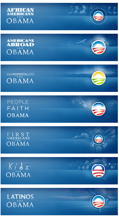
out losing its essence. Take a look at the “People” page on Barack’s website, and you can see what I mean about the logo’s adaptability to suit other purposes. (For an amusing example: http://logobama.com/) The logo was successfully and tastefully adapted to appeal to a dozen or so different constituents, and as a SpeakUp blog entry on this subject says:
“The iterations are quickly identifiable and feel genuinely concerned with connecting to the people they are talking to, without pandering. The executions are rather flawless and work perfectly on screen with the detailed gradients and subtle background illustrations. Even the typography is lovingly handled, with each segment changing ever so slightly and unified by the use of Gotham in most of the applications, and using other typefaces as fitting — even the “kids” typography looks finessed, despite the looming pitfalls of faux child-drawn typography. This kind of playful flexibility is typically reserved for the likes of MTV, VH1 or Nickelodeon and the breadth of this kind of brand architecture for global corporations with endless divisions.”
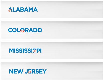
The SpeakUp blog post also shows how the logo was adapted for use with all the state-specific pages on
Barack’s website, and can be seen below as well:
What makes this logo so easy to manipulate without losing its symbolism and brand identity? Well, I suppose it never hurts to use red, white and blue as your colors, and the logo can be used with and without Obama’s name, and the flag’s “stripes” could also be the “American field of dreams” or the “American farmland” and the white sun represents a new sunrise, hope, change, and every other Obama campaign buzzword. It fits nicely. As another blogger puts it,
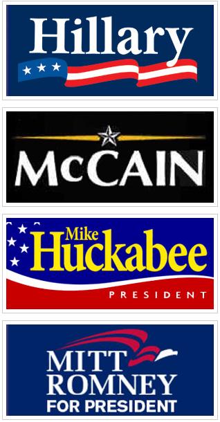
“what the logo is trying to say is that there’s a new morning sun (a hope, change) rising over America, and that Obama is it. I don’t think you can find that level of meaning in any other logo, campaign or corporate. For contrast, take a look at the other campaign logos:”
Well, there is probably more that can be said of substance about Barack’s logo, but that’s all I will say.
-Marco
